A baby step forward is still progress, no matter how small.
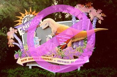
Whether it was due to Exxon's sponsorship pull-out of Epcot's Universe of Energy or an astute management decision from someone at Disney with taste, the aggressively ugly marquee that sat beside the pavilion is now history. No longer will guests be barraged by over-zealous splashes of mauve, crowded visual elements, pop-icon mugging, covert explosions of pink triangles, incongruous type fonts and golden dinosaurs all randomly glued to a cheap milk crate backing. This was a visual eyesore so discomforting it didn't belong at a Six Flags park, let alone Epcot Center's classy Future World.
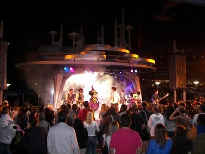
On the other side of the country the final retro touches have been affixed to the once equally ugly Club Buzz at Disneyland's Tomorrowland. Also back is the original name for the area, The Tomorrowland Terrace. A lone designer at Disneyland's Entertainment Division saw fit to pay homage to the timeless design sensibility of Disney's legendary Imagineer Rolly Crump and his original modernist motif for this unique rising bandstand. Though not an exact re-fit of Rolly's whimsical airy space-age planters, it's a genuine and heartfelt nod to his take on a promising optimistic future. Club Buzz, on the other hand, was a heavy, brooding, dystopian monolith that sucked all the life out of the area.

Those that value great design and a quality guest experience right down to the smallest detail have reason to rejoice at these recent, albeit minor, changes. Progress at a snail's pace is still better than decay and destruction at any pace.

16 comments:
Thanks for posting the positive changes. Hopefully we will see Disney management get back into tune with Walt Disney's mindset and not forget that the "show" is comprised of many little things too. Such as signs, decorations, plants, names etc. These all help make the "show"
The first time I saw the restored Rolly Crump design, I was amazed at how well it fit into the architecture and landscape of Tomorrowland. Way to go WDI! There's a lot more of Tomorrowland that needs to be restored. Inoventions anyone!
The first time I saw the restored Rolly Crump design, I was amazed at how well it fit into the architecture and landscape of Tomorrowland. Way to go WDI! There's a lot more of Tomorrowland that needs to be restored. Inoventions anyone!
Mr. Kaye is owed many many thanks for attempting to bring back some of Crump's magnificent fountain/planters.... He's a good egg in my book!
I was at Disneyland this past weekend and made a point of checking out the new Tomorrowland Terrace. I never got to see the original version but never wavered in that Club Buzz was a complete horror show. The new design is beautiful, elegant, interesting and futuristic. Just what Tomorroland should look like. Now they just have to get the rest of the land to match it.
The new blue and white paint along with the new Tomorrowland Terrace are definite steps in the right direction.
While I like that they brought back the old design (are they going to fill those bowls with some plants or something? I think a little green would be lovely, but maybe that's just the interior designer in me?), am I the only one that misses the sculpture that briefly appeared when the "New" Tomorrowland made it's debut in 97? Am I totally alone there?
Hopefully these changes will be followed up at Epcot with the removal of the wand over Spaceship Earth.
"Progress at a snail's pace is still better than decay and destruction at any pace."
Well said.
When Club Buzz existed I couldn't bring myself to even look at it. I wouldn't even walk by it if I didn't have to. It was such a crime what happened to that whole end of the park, and Club Buzz was almost the worst of it.
The actual worst of it was what happened to the old Carousel of Progress/America Sings building.
Progress at a snail's pace is still better than decay and destruction at any pace.
Sorry, to disagree -- unfortunately with Disney -- especially true pre-Iger -- it was one step forward and 10 steps back.
Yes, I'm optimistic about the future -- but the rebirth needs to come at a quicker pace. And, for every good sign -- Rolly's Tomorrowland Terrace for example -- we get bone-headed decisions to retheme Tom Sawyer's Island, to turn the Golden Horseshoe into an ice cream parlor and on and on ad naseum.
So sorry, I remain as skeptical as I do hopeful until I see some more results.
I heard a doctor once say that "progress is defined by direction and not speed." I think that works in this context too. And here we have progress! So I agree that we should give credit where credit is due. Kudos!
Um . . That Universe of Energy Sign has been gone for over two years now. Are you just noticing this?
How about yanking down the EPCOT wand and the Studios' sorceror hat while we're at it?
Please take down that awful wand on EPCOT! The wand makes Spaceship Earth a label and not the powerful symbol that it should represent.
Randolph said:
>>>Um . . That Universe of Energy Sign has been gone for over two years now. Are you just noticing this?<<<
It was still up when I visited Epcot in October of 2005.
I think this is a small, but promising step in the right direction. It's going to be baby steps before we see any real changes, but thankfully, we ARE seeing steps. If we had to sit around for another few years of the same mismanagement with not even a small sigh that things were changing, then I'd be concerned. But one must expect if they want big changes, that smaller changes must preceed it. It's going to take time and patience before we see some real positive change on a grand scale. But the fact we are seeing changes now, no matter how small, means that the "disease" is finally being addressed in places.
But as I said in response to a previous blog, we shouldn't really be expecting this blog to be ALL about the positive steps Disney is taking. From the start and from the header, it has stated its been about addressing the problems with Disney. Some little commendation is good along the way, especially when problems discussed in the past are addressed by Disney in some manner. But at it's heart, this blog has always been about diagnoses. There's no logic in criticizing the blog, when that's what the blog is about.
Incredibles, it wasn't my intention to insinuate that people should keep their opinions to themselves. It was my intention to point out that, for a while now, people have been making statements that all this blog has to say is negative things. Well, that's kind of the point.
I would never venture to say that people should keep their their opinions to themselves. Otherwise what's the point of discussion? But I would be remiss not to point out that criticizing a blog for doing what it said it was going to do in its header, is like criticizing Star Trek for always going where no one has gone before.
It's nice to see some positive comments in this blog. I would be ecstatic if this blog were responsible for that change even on a subliminal level. But a blog that is supposed to "catalog past Imagineering missteps" would likely remain focused on the things wrong with Disney, so that in the future, positive comments become commonplace. I don't mean to criticize the criticizers. I simply mean to point out that there's a focus to this blog that's spelled out in it's charter, and it seems odd that many demand it to deviate from that.
I agree, Digital Jedi.
Post a Comment