Let the drums roll out! Let the trumpets call! Let the people sing! Strike up the band!
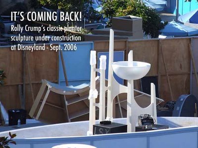
It may be appear to be an insignificant trifle in the great corporate universe of the Disney Company, but the re-installation of a classic Disneyland detail gives all those who care about good taste, timeless design and the heritage of Walt's classic theme park reason to rejoice.
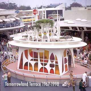
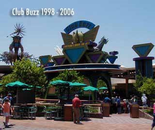
Rolly Crump's fanciful space-age planters that festooned the original Tommowland Terrace bandshell appear to be making a return. For three decades this classic Disneyland icon never lost its design appeal or its ability to transport guests to a groovy sleek and optimistic world of tomorrow. When Rolly's imaginative ornamentation disappeared with the installation of Club Buzz, a heavy-handed, grim and aggressively unappealing redressing of the stage in 1998, Disneyland not only lost a peice of great design from an accomplished artist but it lost a bit of its heritage as well.

But somewhere, somehow, someone at Disneyland's Entertainment Division is fighting the good fight. To those who reinstated this glorious Disneyland gem, bravo to one and all.
May this be the beginning of a great big beautiful tomorrow.


24 comments:
Don't remember when Club Buzz took over, but it wasn't 1998. It was a few years later IIRC.
Funny, my research actually says 1997. Any additional information would be appreciated.
Sweet! I love that original design! It's a much more interesting looking and fanciful design. Hopefully this boeds well for further changes throughout all Tomorrowland.
I agree that the old planters where MUCH better than Club Buzz.
Isn't it a little ironic to make tommorrowland a better place by re-creating the past though?
I'm *sure* it wasn't 97... I was there in june '97, and there was definitely a band playing in the old fixture at that point, with much of the rest of tomorrowland under construction around it...
I hate to be a buzz kill here...but as much as I like the original design and Rolly Crump's work in general, I think this illustrates everything that's wrong with WDI's Disneyland contingent today:
First, the stage/planter is a nice and beautiful work of 60's-style design - but it's not 1967 anymore. It's not going to fit in with the rest of today's Tomorrowland, and it'll stick out (sorry) like a sore thumb.
More importantly, while the "Club Buzz" stage was uglier than Zurg's butt, is going back to the original 40-year-old design the best concept WDI could come up with?!? How about something new and better? Where's this generation's versions of Rolly Crump? If WDI doesn't have any - don't you think they better go find some fast?
Despite the great childhood memories I have of the 1967 version of Tomorrowland, I don't want today's Disneyland to be an homage to its previous self. I want a newer, better, greater Disneyland.
In 1998 the Tomorrowland Terrace stage decor was changed to an icky purple and yellow globe and arrow garden sculpture design for TL '98, then became the still worse Buzz design in the early 2000's.
In any event, welcome back Rolly and classic, mod Tomorrowland! I haven't been this thrilled since the Tiki Room restoration and the repainting of Space Mountain!
Keep it coming, fellas...
Wow, they are getting it! I think this is fabulous! Good job you all! Keep it up! Hey if more stuff like this continues, I may become a fan again...
Can't wait to see it finished!
Don't you think that this retro look will clash with the current look. It's nice but it just screams 60's B-Movie SciFi.
>>Don't you think that this retro look will clash with the current look. It's nice but it just screams 60's B-Movie SciFi.<<
Since the recent look sucks - - I say go to the best possible design available. If that happens to be 40 years old, so be it!
...And how was turn-of-the-century retro somehow more relevant to the Now than mid-century retro? What a wierd intellectualized argument this last ten years have been. Living with cat's ass ugly just because it was "new."
New or old, ugly is ugly and cool is cool. Rolly's work is cool and beautiful and inspiring, no matter the decade.
"New or old, ugly is ugly and cool is cool. Rolly's work is cool and beautiful and inspiring, no matter the decade."
Three cheers for a voice of reason! I'd gladly welcome a new design that was as inspiring, interesting and well themed to Tomorrowland as teh 60's version. Trouble is that we haven't seen anything like that.
As for the this new-old design fitting in with the current look of Tomorrowland, there has been much talk about Tomorrowland getting a face lift. In fact, it's already started with the blue and silver repainting. I'm sure this recent development is only another step in a direction that is already planned out. Tomorrowland is changing and it looks like it's changing back into a vital, interesting and beautiful place. I'm all for it.
Using the old design again will look interesting when it rises up with Darth Vader and Darth Maul on the stage underneath for the climax of that Jedi Training Academy show they're apparently putting into that area.
The Club Buzz design was uglier than Rollo's design, but I tend to agree with Dan_steinberg's comments and most importantly his question "Where is this Generation's Rollos???" the fact that WDI didn't even seek outside help in this and just stuck an Old fixture into the park, shows just what a shakeup the parks need.
WE NEED SOME NEW IDEAS FOR TOMMORROWLAND!!! As much as I loved the old design, and hated the new one, I want to see something new and great looking. Maybe, just maybe the re-addition of this Rollo designed area will only be temporary until today's versions of Rollo come up with some fresh ideas for this area. If not I'm afraid tommorrowland will start becoming staler than week old garbage. Than again, maybe not, everyone needs to get proven wrong every now and again maybe this is one of them. Maybe the re-addition of the Rollo design is merely to start updating the "old" tommorrowland, even if those designs are from the 60s with a bit of a facelift they can look newer and fresher than anything that that ugly monstrosity "Club Buzz"
from what I have heard from friends at the park, this work is actually being done by the entertaimment division as part of that new Jedi show, not WDI. it is not a lift, I guess, but a new look that has been created as a tribute to the earlier one, but made to fit to the newer bits of Tomorrowland and the Jedi show.
>Maybe, just maybe the re-addition of this Rollo designed area will only be temporary until today's versions of Rollo come up with some fresh ideas for this area.<
Lack of Rollys making magic is less the problem than lack of Walts who believe in it.
Seeing this new sculpture in person it looks like somehting that merely emulates the original but not an exact copy. I think an exact copy would look terribly outdated. However something in that style perhaps even sleeker and more modern would tie in very nicely to Space Mountain which still has those spires pointing man to space...
Here is another photo, this time from Wednesday, with the work completed, and the refurb walls removed.
http://darkbeer.smugmug.com/gallery/1940744/25/98405051/Large
New or old, ugly is ugly and cool is cool.
Which is why Epcot was originally done in a mauve and gray color scheme, the epitome of early-80's cool much the same way Rolly's planters and the orange and yellow stained glass were the height of cool in the 60's.
...
Oh, wait. It wasn't, was it. Sorry, Merlin (et al), but "cool" is momentary. What we should be aiming for is "timeless" and "aesthetically pleasing". I love Rolly's work in other parts of the park, thought Club Buzz was ass-ugly from the beginning, but the new-old Tomorrowland Terrace gives me the same embarrassed, "oh my gawd, people took that seriously?" giggles as pictures of my mom's old hair-do's do.
I will admit the new-old white planters are easier on the eye than Buzz's garish color scheme. Buzz's shapes were pretty cool, I thought, though. Very Art Deco, when divorced from the colors. Coolness may be the wrong criterion by which to judge these changes.
If the new vision for Tomorrowland is "the future as envisioned in the Atomic Age", that's every bit as legitimate (and goofy) as "the future as envisioned in the Victorian Age". Personally, I'd rather see "the future as envisioned today". As the difference between Tomorrowland '98 and Discoveryland in Paris shows, it's all in how you execute it.
I work in Tomorrowland and we have all been eagerly awaiting the new stage design. I just saw it today -- looking mostly done and out from behind the walls. I was so pleased to see Tomorrowland Terrace starting to look like its old self again! Like welcoming home an old friend! In my eyes, it was never Club Buzz - I refused to call it that!
I look forward to other changes that come to Tomorrowland. It looks like they have made a step in the right direction! I am now hoping that with the TLT's stage design maybe we will see the white planters return to the Tomorrowland entrance walls as well! :)
I think the successful remake of Space Mountain demonstrates that you don't have to completely forsake what's there to come up with something fresh. I can only imagine the wonderful environment that could have been created had this approach been taken with the 90's remake of Tomorrowland instead of making everything brown and lifeless looking.
It looks like they will recreate it from photographs, which sounds like a cool thing, having the original structure there-maintain the history of the place. But I'd kinda rather see them redo the whole area anew with that style as inspiration. And the last thing I'd wanna see return to Tomorrowland is that Small World mural.
Tomorrowland is supposed to be an optimistic representation of the future. This needs to return. They should put in a new, modern People Mover, extend the Monorail through that Disney mall area and perhaps along Harbor, and they need to electrify the Autopia...part of the ride is that the little sportscars periodcally have to be driven into a recharge pit and your rider whose tall enough to ride gets to plug it in. (o)
What's new is old and what's old is new. We all know the saying. Trends are circular. So why not go back to the original design? But what happens when the response on a futuristic design for a planter/bandstand just becomes trendy kitsch? I feel that Imagineers these days are on two extreme ends of the spectrum. You have the Imagineers that want to re-gut, redesign, re-imagineer and blow a budget on something completely new and "great" for the times with their stamp on it and you have the Imagineers that are wanting the timeless feel for what Walt created in the first place. The new/old Rolly planter is a step but I don't see a middle ground. I love rolly's designs and I enjoy the mod feel of it. I do think it's going to seem somewhat out of place. I don't understand why when Imagineers set forth to replace Club Buzz and when the idea of putting back rolly's design came forth someone didn't come up with something different. I think that if the idea was proposed why didn't they start with the basis of rolly's designs and simply just "plus" it. New materials, new color treatment, etc. I think that my opinion goes hand in hand with the latest post on this blog. If Imagineers really went to the parks and looked at how tomorrowland is designed they could of re-imagineered this planter with the spirit of the orginal but with the feel of today. This all seems like it was decided in the offices of WDI in Glendale at a drop of a dime. "Hey I have it, let's just put it back how it was and then later we can put Mary's murals back as well!" That blue sky session must of been a hoot!!!
One of the most interesting things I notice when we start talking about Tomorrowland is that the original designs are, ironically, very dated (bear with me a moment, I do have a point here and it's not an apologist one).
By dated, I mean that they incorporate a lovely futuristic design - at least, what was considered futuristic back in the mid-1960's. To any modern visitor who would view the original Tomorrowland design, their first response would be unlikely to involve thoughts of futurism, but rather thoughts of nostalgia for the kind of futurism we got back then.
The implemented solution to this problem is admittedly quite horrible - Club Buzz is as appealing to the eye as a poke from a sharp stick - but that isn't due to the fact that a change was made, it's because of the type of futurism our modern society's become enamored with.
I'll say it simpler: has there been a single successful film in the last ten years which presented a futuristic world that was not dystopian in nature? Club Buzz looks like something out of Brazil to my eye, reflecting a fundamental distrust of and pessimism about the future.
As a denizen of today's present, I don't see why Tomorrowland should reflect yesterday's tomorrow. Personally, I'd be far more pleased to get a peek at today's tomorrow, rendered with the same excitement that the original design showed.
Here's my thought...The way that Theme Parks have developed over the years, I think it became obvious that keeping up with what the future will hold is not a very realistic goal. Look at Epcot at Walt Disney World, for example. They have scaled back on the amount of space used to present the "future", and have gone with a more conservative approach by basing new attractions off of current technologies with very little "post show" space. Innoventions is almost the only area in the park that is updated with as technology progresses.
Having said that, let's turn our attention to Walt Disney World's Tomorrowland at the Magic Kingdom. Instead of "moving forward" in the timeline when they reimagined their land, they went with a "Future that never was" approach. In doing so, they created a land that evoked a feeling of "futurism" in anyone who entered it. Disneyland Paris even went as far as to do away with the "Tomorrowland" name completely. There, Discoveryland gives visitors a glance at a completely different "Future that never was" concept. Tokyo Disneyland has kept their Walt Disney World inspired design since opening, making only minor adjustments to paint colors and signage. They have decided, for the time being, to keep their originally futuristic design. This, too, has now become a "Future that never was". Hong Kong Disneyland has created a new type of Tomorrowland, that doesn't necessarily focus on technology or the future...it just looks pseudo-futuristic due to the trendy lines of the buildings...graceful, flowing lines that give a sense of kinetic energy.
Disneyland's Tomorrowland (cir. 1967) was full of kinetic energy...the Peoplemover, Rocket Jets, Subs all played a role. The spires and angles of the land only helped to accent that kinetic energy by giving visitors something other than horizontal and perpendicular lines to look at. I think Disneyland's slight step backward to their "Future" that never came to pass only helps to bring them in line with the other Tomorrowland concepts while maintaining their Tomorrowland's individuality. Since we can't focus on the "real" tomorrow financially, why don't we just inspire creativity by simply creating an environment that sparks new thoughts from old designs? Sure, the spires on the stage are based on an old design...but you can't tell me that when you look at them, you don't get a feeling of optimism from them. They reach towards the stars...and the future...and that to me is enough to want me to name the land "Tomorrowland".
I say HUGE kudos to Disneyland for taking a step back. Disneyland is all about nostalgia and optimism. The nostalgia of turn of the century America, the nostalgia of the old west, the nostalgia of being a kid dreaming of being a prince or princess, and the nostalgia of the most optimistic time in our country's history...the 1960's.
Disneyland = optimism...Retro Tomorrowland = Great Big Beautiful Tomorrow
...and that's my two cents.
TiKi
Post a Comment